1.1 Main node of the project

In the pages section, the edit button of the project node is displayed next to the project name, which can contain several project pages as the top most instance. After pressing the Edit button the project node can be edited in its properties.
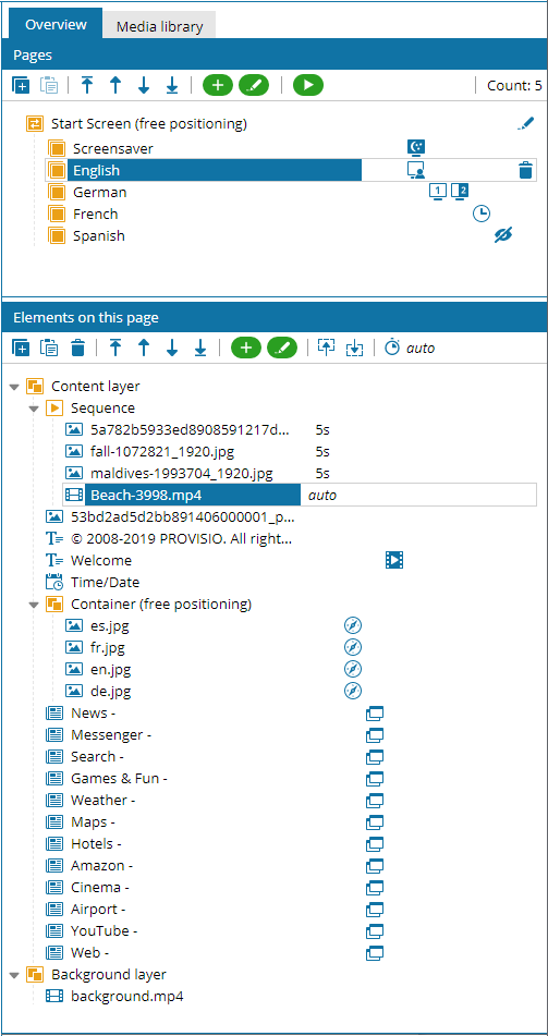
1.2 Pages
In the section Pages, the individual project pages of the project are displayed, which can also be edited by double-clicking or after selection by clicking the edit button in the page toolbar. After selecting a page, all elements of this page are listed in the below section Elements on this page in a tree view.
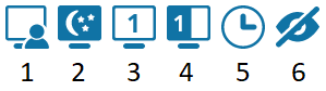
In the section pages you will find the page toolbar, which offers the most important functions to edit pages:
- The Copy button can be used to copy a selected page.
- The Paste button can be used to paste a copied page.
- The Delete button deletes a selected page.
- Use the arrow buttons to move the selected page one position forward or backward.
- With these arrow buttons you can move the selected page to the start or the end.
- The Add button inserts new pages.
- With the Edit button the properties dialog of a selected page can be opened.
- With the Play button you can start the preview of the currently selected page.
1.3 Elements on this page

In the section Elements of this page you will find the Element toolbar, which offers the most important functions to edit elements:
- The Copy button can be used to copy selected elements.
- The Paste button can be used to paste copied elements in a selected container.
- The Delete button deletes selected elements.
- The arrow buttons can be used to move elements to the end or the beginning, or to move them to the lowest and uppermost level within containers.
- The arrow buttons can be used to move elements one position forward or backward, or to move elements one layer up or down within containers.
- With the Add button new standard elements and element templates can be placed in selected containers
- With the Edit button the properties dialog of a selected element can be opened.
- With the Select next/previous element buttons the next or previous element within a container can be selected.
- The Display time edit box can be used to define the display duration of elements within a sequence.
Please note:
With selecting multiple Elements the corresponding toolbar functions are applied to all selected elements.
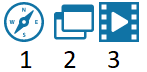
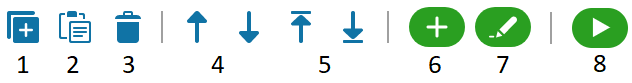
 In addition, different icons in the overview are used to indicate whether the display conditions are activated on the existing elements:
- The first icon is displayed when the Screensaver option User is active is activated.
- The second icon is displayed when the Screensaver option Screensaver (user is idle) is activated.
- The third icon is displayed when the option Monitor (primary monitor, secondary monitor) is activated.
- The fourth icon is displayed when the display condition Split screen (1, 2) is activated.
- The clock icon is displayed when a Schedule option is activated.
- The eye with strikethrough icon is displayed when the option Do not display (only visible in editor) is activated.