Home > Standard elements > Basic element properties > Navigation
Navigation
Using the navigation feature, each element can be converted into a button that you can use to display defined elements in a swap container. With the aid of this navigation function, interactive projects can be designed in which the configured buttons can be used to display different pages and elements. A concrete example of this is a digital menu, in which by clicking different menu pages such as appetizers, main courses, desserts and drinks can be presented.
1. Activation of the Navigation function
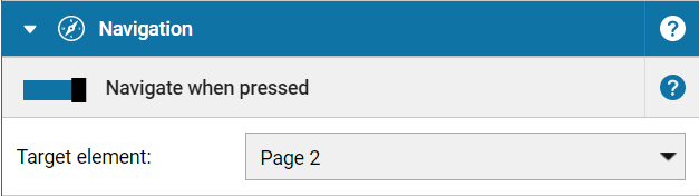
Switching the switch Navigate when pressed activates the selection menu Target element. Then select in the selection menu
the target element of your choice, which should be displayed in the swap container when toggling (clicking/tapping) the element. In the Target element selection menu all elements of a project are offered which are located within a swap container. When the navigation function is activated, the corresponding element is marked with a navigation icon in the overview.
Please note:
The navigation can also be configured over several levels, if the defined target element lies inside a navigation container, which in turn lies within a navigation container itself. Activation of navigation on elements within the background does not work because they can not be clicked!
See also
Back To Top